Column: Even Kate Middleton can make a mistake

0

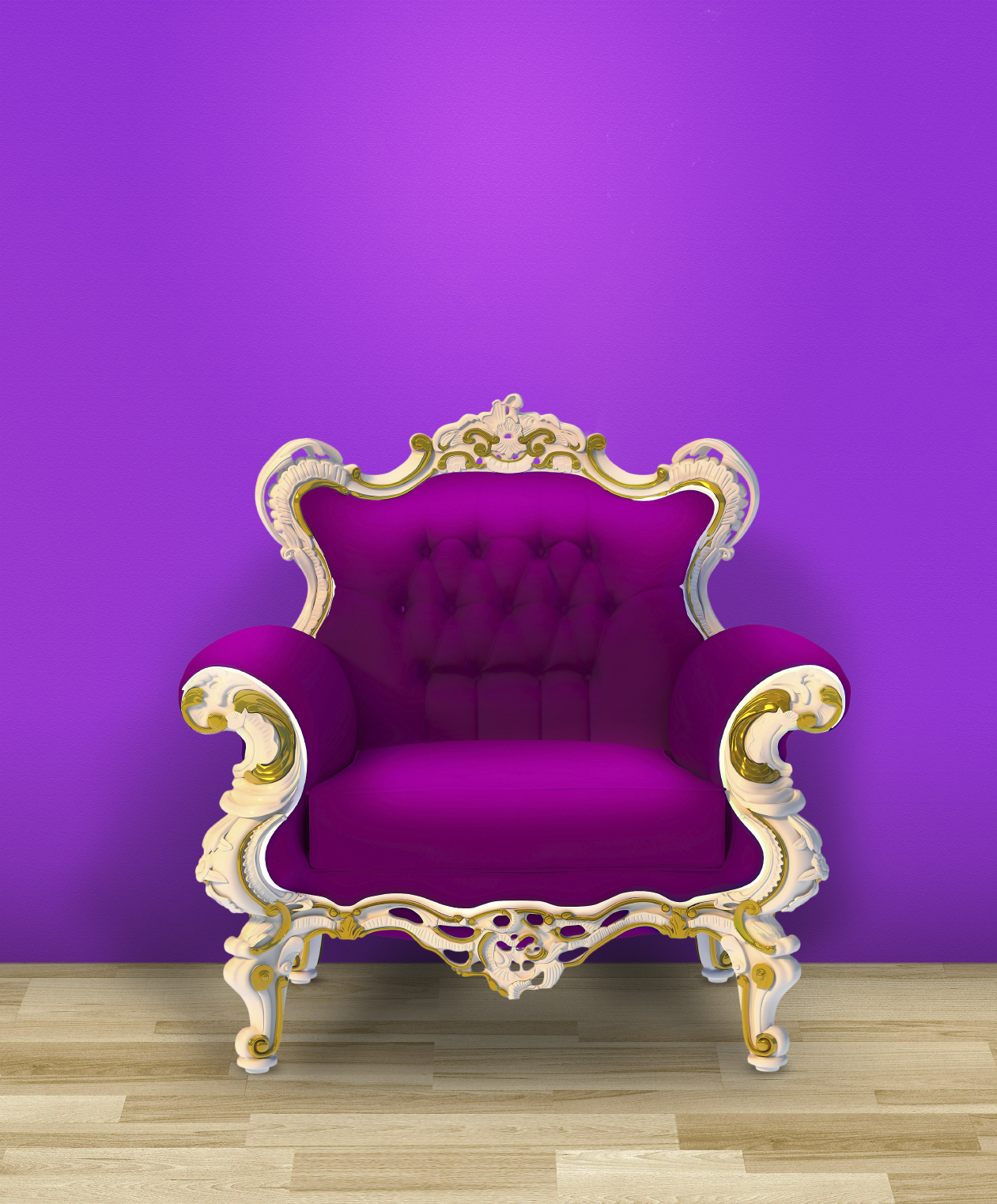
IO-Earley Purple throne

Hey, Kate … it is all over the news. Sorry about that unfortunate blunder you made during your recent Kensington Palace apartment remodel project.

You should have called me … I could have helped you avoid the design faux pas that is plastered on every tabloid in the grocery store aisle.

What were you thinking, anyway? Trying to duplicate a color taken from the palette of a quality paint manufacturer and using a less expensive one is destined to be a flop.

I respect you for wanting to save your British subjects a few pounds. Unfortunately, since you tried to cut corners, without really knowing what you were doing, you ended up spending more than if you had done the project properly in the first place.

Kate, in the future, consult a color expert before making those decisions. The person doing your remodeling is not a color expert. Trying to create a Farrow & Ball color … excuse me, colour, from a brand that has a different formulation, is like trying to imitate one of your silk couture gowns from an Irish potato sack.

I know you said it was pregnancy hormones that made you do it. Honestly, I doubt a bout of morning sickness was the cause. My guess is that you are in a decorating pickle because you are young, inexperienced and design is not your area of expertise. You simply thought that a color is a color is a colour, right? Not so.

The masses of the paint production industry have incorporated cost saving changes to their base formulations by substituting miscellaneous fillers.

Your original design choice came from a Farrow & Ball palette. The ultimate result from paint goes far beyond the color on a chip. It depends on the amount and quality of the resins, pigments, and additives inside those cans of paint.

That horrible purple tinge that is giving you sleepless nights is the result of different base formulations. You know …  that stuff that is in the can before they put the drops of color in. That base seems innocuous enough but it makes all the difference to the end result.

Trying to cut corners without really knowing what you were doing will now cost more than if you had done your royal project properly in the first place.

Here is a bit of additional free advice from a specialist on the other side of the pond.

When you make your next choice, don’t try to match a fabric or object exactly. Color is illusive and a tone, rather than a match, gives a layered effect.

Even if you are longing for color to brighten up the dreary British weather, avoid overly bright colors. Complex, muted colors will always make your room look richer. Oh wait, you are already rich.

I hope you don’t fear the tabloid trauma of another mistake and go the “safe route” by opting for creamy white everywhere. I understand your reluctance to waste another cent since you have already spent more than £1 million of taxpayers’ money on making your Kensington Palace apartment fit for a king.

Next time you start a royal decorating project and feel like you want to avoid mistakes, call me. I am in the book.

Share.

Column: Even Kate Middleton can make a mistake

0

IO-Earley Purple throne

Hey, Kate … it is all over the news. Sorry about that unfortunate blunder you made during your recent Kensington Palace apartment remodel project.

You should have called me … I could have helped you avoid the design faux pas that is plastered on every tabloid in the grocery store aisle.

What were you thinking, anyway? Trying to duplicate a color taken from the palette of a quality paint manufacturer and using a less expensive one is destined to be a flop.

I respect you for wanting to save your British subjects a few pounds. Unfortunately, since you tried to cut corners, without really knowing what you were doing, you ended up spending more than if you had done the project properly in the first place.

Kate, in the future, consult a color expert before making those decisions. The person doing your remodeling is not a color expert. Trying to create a Farrow & Ball color … excuse me, colour, from a brand that has a different formulation, is like trying to imitate one of your silk couture gowns from an Irish potato sack.

I know you said it was pregnancy hormones that made you do it. Honestly, I doubt a bout of morning sickness was the cause. My guess is that you are in a decorating pickle because you are young, inexperienced and design is not your area of expertise. You simply thought that a color is a color is a colour, right? Not so.

The masses of the paint production industry have incorporated cost saving changes to their base formulations by substituting miscellaneous fillers.

Your original design choice came from a Farrow & Ball palette. The ultimate result from paint goes far beyond the color on a chip. It depends on the amount and quality of the resins, pigments, and additives inside those cans of paint.

That horrible purple tinge that is giving you sleepless nights is the result of different base formulations. You know …  that stuff that is in the can before they put the drops of color in. That base seems innocuous enough but it makes all the difference to the end result.

Trying to cut corners without really knowing what you were doing will now cost more than if you had done your royal project properly in the first place.

Here is a bit of additional free advice from a specialist on the other side of the pond.

When you make your next choice, don’t try to match a fabric or object exactly. Color is illusive and a tone, rather than a match, gives a layered effect.

Even if you are longing for color to brighten up the dreary British weather, avoid overly bright colors. Complex, muted colors will always make your room look richer. Oh wait, you are already rich.

I hope you don’t fear the tabloid trauma of another mistake and go the “safe route” by opting for creamy white everywhere. I understand your reluctance to waste another cent since you have already spent more than £1 million of taxpayers’ money on making your Kensington Palace apartment fit for a king.

Next time you start a royal decorating project and feel like you want to avoid mistakes, call me. I am in the book.

Share.

Column: Even Kate Middleton can make a mistake

0

IO-Earley Purple throne

Hey, Kate … it is all over the news. Sorry about that unfortunate blunder you made during your recent Kensington Palace apartment remodel project. 

You should have called me … I could have helped you avoid the design faux pas that is plastered on every tabloid in the grocery store aisle.

What were you thinking, anyway? Trying to duplicate a color taken from the palette of a quality paint manufacturer and using a less expensive one is destined to be a flop.

I respect you for wanting to save your British subjects a few pounds. Unfortunately, since you tried to cut corners, without really knowing what you were doing, you ended up spending more than if you had done the project properly in the first place.

Kate, in the future, consult a color expert before making those decisions. The person doing your remodeling is not a color expert. Trying to create a Farrow & Ball color … excuse me, colour, from a brand that has a different formulation, is like trying to imitate one of your silk couture gowns from an Irish potato sack.

I know you said it was pregnancy hormones that made you do it. Honestly, I doubt a bout of morning sickness was the cause. My guess is that you are in a decorating pickle because you are young, inexperienced and design is not your area of expertise. You simply thought that a color is a color is a colour, right? Not so.

The masses of the paint production industry have incorporated cost saving changes to their base formulations by substituting miscellaneous fillers.

Your original design choice came from a Farrow & Ball palette. The ultimate result from paint goes far beyond the color on a chip. It depends on the amount and quality of the resins, pigments, and additives inside those cans of paint.

That horrible purple tinge that is giving you sleepless nights is the result of different base formulations. You know …  that stuff that is in the can before they put the drops of color in. That base seems innocuous enough but it makes all the difference to the end result.

Trying to cut corners without really knowing what you were doing will now cost more than if you had done your royal project properly in the first place.

Here is a bit of additional free advice from a specialist on the other side of the pond.

When you make your next choice, don’t try to match a fabric or object exactly. Color is illusive and a tone, rather than a match, gives a layered effect.

Even if you are longing for color to brighten up the dreary British weather, avoid overly bright colors. Complex, muted colors will always make your room look richer. Oh wait, you are already rich.

I hope you don’t fear the tabloid trauma of another mistake and go the “safe route” by opting for creamy white everywhere. I understand your reluctance to waste another cent since you have already spent more than £1 million of taxpayers’ money on making your Kensington Palace apartment fit for a king.

Next time you start a royal decorating project and feel like you want to avoid mistakes, call me. I am in the book.

Share.