Announcing the 2014 Color of the Year

0

IO - Earley - orchid

Move over, emerald. So long, tangerine tango. Make room for the now and current. The Color of the Year, that will leave its mark on interior design as well as fashion, is PANTONE 18-3224 Radiant Orchid.’

The PANTONE Color Institute describes their carefully selected hue as, “Imbued with a harmony of fuchsia, purple and pink undertones, Radiant Orchid inspires confidence and its rosy undertones emanate great joy, love and health.”

The prediction of trends is part fashion, part sociology and part crystal ball. It is clear that the color of the year is not just a random selection made by a group looking for a pretty color. PANTONE describes the selection by saying, “To distill the prevailing mood into a single hue, the PCI team, led by Executive Director Leatrice Eiseman, combs the world looking for future design and color influences, watching out for that one color seen as ascending and building in importance through all creative sectors. Influences can include the entertainment industry, upcoming films, art, emerging artists, travel destinations and socio-economic conditions. Influences may also stem from technology, lifestyles and play styles, new textures and effects that impact color, and even upcoming sports events that capture worldwide attention.”

I say, I love the change. If it is an indication of a more colorful outlook, then let’s go, bring it on!

Who is PANTONE, anyway?

They are the industry leader of Color Matching Systems for textiles, printing and any entity that relies on color. It is a system whereby manufacturers in different locations can indicate the usage of a color that is found in a PANTONE deck and trust that it will be understood by suppliers and vendors. Simply put, PANTONE offers color matching without direct contact.

Although you have not noticed this pinky, purple hue as a hot fashion color thus far, you will begin to see it entwined in fashion and home décor.

Previous winners of Color of the Year have been:

 17-5641 Emerald (2013), Tangerine Tango 17-1463 (2012), Honeysuckle 18-2120 (2011), Turquoise 15-5519 (2010), Mimosa 14-0848 (2009), and Blue Iris 18-3943 (2008).

Congratulations to Radiant Orchid, the Color of the Year for 2014! We are ready for the change!

Share.

Announcing the 2014 Color of the Year

0

IO - Earley - orchid

Move over, emerald. So long, tangerine tango. Make room for the now and current. The Color of the Year, that will leave its mark on interior design as well as fashion, is PANTONE 18-3224 Radiant Orchid.’

The PANTONE Color Institute describes their carefully selected hue as, “Imbued with a harmony of fuchsia, purple and pink undertones, Radiant Orchid inspires confidence and its rosy undertones emanate great joy, love and health.”

The prediction of trends is part fashion, part sociology and part crystal ball. It is clear that the color of the year is not just a random selection made by a group looking for a pretty color. PANTONE describes the selection by saying, “To distill the prevailing mood into a single hue, the PCI team, led by Executive Director Leatrice Eiseman, combs the world looking for future design and color influences, watching out for that one color seen as ascending and building in importance through all creative sectors. Influences can include the entertainment industry, upcoming films, art, emerging artists, travel destinations and socio-economic conditions. Influences may also stem from technology, lifestyles and play styles, new textures and effects that impact color, and even upcoming sports events that capture worldwide attention.”

I say, I love the change. If it is an indication of a more colorful outlook, then let’s go, bring it on!

Who is PANTONE, anyway?

They are the industry leader of Color Matching Systems for textiles, printing and any entity that relies on color. It is a system whereby manufacturers in different locations can indicate the usage of a color that is found in a PANTONE deck and trust that it will be understood by suppliers and vendors. Simply put, PANTONE offers color matching without direct contact.

Although you have not noticed this pinky, purple hue as a hot fashion color thus far, you will begin to see it entwined in fashion and home décor.

Previous winners of Color of the Year have been:

17-5641 Emerald (2013), Tangerine Tango 17-1463 (2012), Honeysuckle 18-2120 (2011), Turquoise 15-5519 (2010), Mimosa 14-0848 (2009), and Blue Iris 18-3943 (2008).

Congratulations to Radiant Orchid, the Color of the Year for 2014! We are ready for the change!

Share.

Announcing the 2014 Color of the Year

0

IO - Earley - orchid

Move over, emerald. So long, tangerine tango. Make room for the now and current. The Color of the Year, that will leave its mark on interior design as well as fashion, is PANTONE 18-3224 Radiant Orchid.’

The PANTONE Color Institute describes their carefully selected hue as, “Imbued with a harmony of fuchsia, purple and pink undertones, Radiant Orchid inspires confidence and its rosy undertones emanate great joy, love and health.”

The prediction of trends is part fashion, part sociology and part crystal ball. It is clear that the color of the year is not just a random selection made by a group looking for a pretty color. PANTONE describes the selection by saying, “To distill the prevailing mood into a single hue, the PCI team, led by Executive Director Leatrice Eiseman, combs the world looking for future design and color influences, watching out for that one color seen as ascending and building in importance through all creative sectors. Influences can include the entertainment industry, upcoming films, art, emerging artists, travel destinations and socio-economic conditions. Influences may also stem from technology, lifestyles and play styles, new textures and effects that impact color, and even upcoming sports events that capture worldwide attention.”

I say, I love the change. If it is an indication of a more colorful outlook, then let’s go, bring it on!

Who is PANTONE, anyway?

They are the industry leader of Color Matching Systems for textiles, printing and any entity that relies on color. It is a system whereby manufacturers in different locations can indicate the usage of a color that is found in a PANTONE deck and trust that it will be understood by suppliers and vendors. Simply put, PANTONE offers color matching without direct contact.

Although you have not noticed this pinky, purple hue as a hot fashion color thus far, you will begin to see it entwined in fashion and home décor.

Previous winners of Color of the Year have been:

17-5641 Emerald (2013), Tangerine Tango 17-1463 (2012), Honeysuckle 18-2120 (2011), Turquoise 15-5519 (2010), Mimosa 14-0848 (2009), and Blue Iris 18-3943 (2008).

Congratulations to Radiant Orchid, the Color of the Year for 2014! We are ready for the change!

Share.

Announcing the 2014 Color of the Year

0

IO - Earley - orchid

Move over, emerald. So long, tangerine tango. Make room for the now and current. The Color of the Year, that will leave its mark on interior design as well as fashion, is PANTONE 18-3224 Radiant Orchid.’

The PANTONE Color Institute describes their carefully selected hue as, “Imbued with a harmony of fuchsia, purple and pink undertones, Radiant Orchid inspires confidence and its rosy undertones emanate great joy, love and health.”

The prediction of trends is part fashion, part sociology and part crystal ball. It is clear that the color of the year is not just a random selection made by a group looking for a pretty color. PANTONE describes the selection by saying, “To distill the prevailing mood into a single hue, the PCI team, led by Executive Director Leatrice Eiseman, combs the world looking for future design and color influences, watching out for that one color seen as ascending and building in importance through all creative sectors. Influences can include the entertainment industry, upcoming films, art, emerging artists, travel destinations and socio-economic conditions. Influences may also stem from technology, lifestyles and play styles, new textures and effects that impact color, and even upcoming sports events that capture worldwide attention.”

I say, I love the change. If it is an indication of a more colorful outlook, then let’s go, bring it on!

Who is PANTONE, anyway?

They are the industry leader of Color Matching Systems for textiles, printing and any entity that relies on color. It is a system whereby manufacturers in different locations can indicate the usage of a color that is found in a PANTONE deck and trust that it will be understood by suppliers and vendors. Simply put, PANTONE offers color matching without direct contact.

Although you have not noticed this pinky, purple hue as a hot fashion color thus far, you will begin to see it entwined in fashion and home décor.

Previous winners of Color of the Year have been:

17-5641 Emerald (2013), Tangerine Tango 17-1463 (2012), Honeysuckle 18-2120 (2011), Turquoise 15-5519 (2010), Mimosa 14-0848 (2009), and Blue Iris 18-3943 (2008).

Congratulations to Radiant Orchid, the Color of the Year for 2014! We are ready for the change!
Share.

Announcing the 2014 Color of the Year

0

IO - Earley - orchid

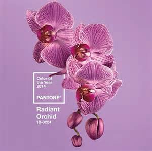
Move over, emerald. So long, tangerine tango. Make room for the now and current. The Color of the Year, that will leave its mark on interior design as well as fashion, is PANTONE 18-3224 Radiant Orchid.

The PANTONE Color Institute describes their carefully selected hue as, “Imbued with a harmony of fuchsia, purple and pink undertones, Radiant Orchid inspires confidence and its rosy undertones emanate great joy, love and health.”

The prediction of trends is part fashion, part sociology and part crystal ball. It is clear that the color of the year is not just a random selection made by a group looking for a pretty color. PANTONE describes the selection by saying, “To distill the prevailing mood into a single hue, the PCI team, led by Executive Director Leatrice Eiseman, combs the world looking for future design and color influences, watching out for that one color seen as ascending and building in importance through all creative sectors. Influences can include the entertainment industry, upcoming films, art, emerging artists, travel destinations and socio-economic conditions. Influences may also stem from technology, lifestyles and play styles, new textures and effects that impact color, and even upcoming sports events that capture worldwide attention.”

I say, I love the change. If it is an indication of a more colorful outlook, then let’s go, bring it on!

Who is PANTONE, anyway?

They are the industry leader of Color Matching Systems for textiles, printing and any entity that relies on color. It is a system whereby manufacturers in different locations can indicate the usage of a color that is found in a PANTONE deck and trust that it will be understood by suppliers and vendors. Simply put, PANTONE offers color matching without direct contact.

Although you have not noticed this pinky, purple hue as a hot fashion color thus far, you will begin to see it entwined in fashion and home décor.

Previous winners of Color of the Year have been:

17-5641 Emerald (2013), Tangerine Tango 17-1463 (2012), Honeysuckle 18-2120 (2011), Turquoise 15-5519 (2010), Mimosa 14-0848 (2009), and Blue Iris 18-3943 (2008).

Congratulations to Radiant Orchid, the Color of the Year for 2014! We are ready for the change!

Share.