I’ve got the blues, baby

0

IO - Earley art

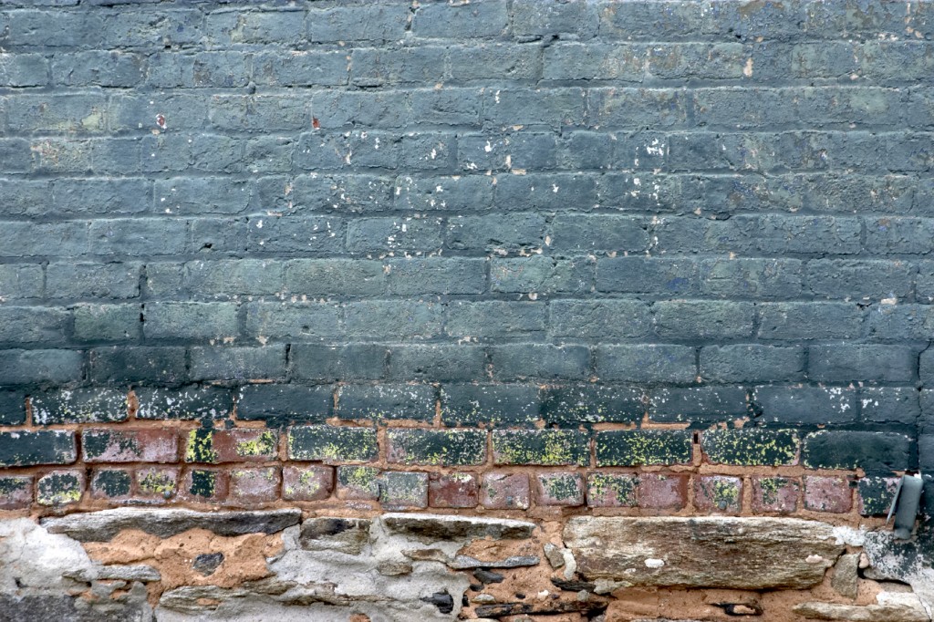
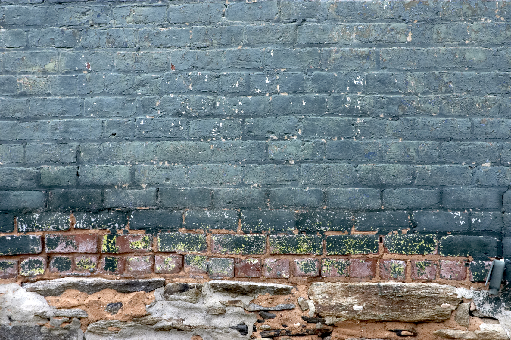
I must confess my head has been turned. While working on our most recent show house, “Living Large in a Small Space,” I have discovered my latest must-have color – sapphire.

This is not your average Crayola blue color pulled straight from a box of primaries. No, sapphire is deep in tone and has the slightest whisper of green. Combined with khaki, it says Boston brownstone. Urban with a side of preppy.

Combine sapphire with orange and you are headed down the path to modern. Imagine dressing sapphire with nickel and accenting with tangerine and you will have the feel of a Nuevo décor paired with richness.

Take that same sapphire and splash it with a mellow green and smoky plum. Suddenly that gemstone hue takes on the mood of a jazz ensemble. The sapphire is the mellow note while the contrast colors are the highs and lows of the saxophone.

Teal blue takes sapphire and pours on the green. It can sometimes be labeled as part of the green spectrum. Teal is a natural for blending with a vibrant green. After all, the peacock always wears this combination well. There is sophistication to teal but it can show a whimsical side as well. Pair it with pink and it is a perfect combination for a girl’s room.

When tranquility is the objective, a paler cousin of blue is order. This can be tricky. Just taking a deep, rich blue to a lighter hue will invariable result in the familiar robin’s egg blue or baby boy blue. This is when grey steps in. The best pale blues are often found on the strips with grey names. The blue undertones take over when the color envelopes the room. The biggest mistake homeowners make when selecting a soft blue is to select a “pretty” color from a stripe. The best blues are complicated and often look unappealing in a color deck.

We cannot talk about my new found color love and leave out the solid, basic navy. Navy can, at times, be so dark that it is confused with black. Just ask anyone who wears socks. There is a  timelessness to navy when it is paired with reds and khaki. It can be progressive in nature when it is revealed with silver, bronze or gold. The metallic captures a modern vibe and passes it on to the traditional mainstay.

Regardless of which tone, a deep, rich blue is an exciting addition to a 2013 color palette when paired with white molding.

Share.

I’ve got the blues, baby

0

IO - Earley art

I must confess my head has been turned. While working on our most recent show house, “Living Large in a Small Space,” I have discovered my latest must-have color – sapphire.

This is not your average Crayola blue color pulled straight from a box of primaries. No, sapphire is deep in tone and has the slightest whisper of green. Combined with khaki, it says Boston brownstone. Urban with a side of preppy.

Combine sapphire with orange and you are headed down the path to modern. Imagine dressing sapphire with nickel and accenting with tangerine and you will have the feel of a Nuevo décor paired with richness.

Take that same sapphire and splash it with a mellow green and smoky plum. Suddenly that gemstone hue takes on the mood of a jazz ensemble. The sapphire is the mellow note while the contrast colors are the highs and lows of the saxophone.

Teal blue takes sapphire and pours on the green. It can sometimes be labeled as part of the green spectrum. Teal is a natural for blending with a vibrant green. After all, the peacock always wears this combination well. There is sophistication to teal but it can show a whimsical side as well. Pair it with pink and it is a perfect combination for a girl’s room.

When tranquility is the objective, a paler cousin of blue is order. This can be tricky. Just taking a deep, rich blue to a lighter hue will invariable result in the familiar robin’s egg blue or baby boy blue. This is when grey steps in. The best pale blues are often found on the strips with grey names. The blue undertones take over when the color envelopes the room. The biggest mistake homeowners make when selecting a soft blue is to select a “pretty” color from a stripe. The best blues are complicated and often look unappealing in a color deck.

We cannot talk about my new found color love and leave out the solid, basic navy. Navy can, at times, be so dark that it is confused with black. Just ask anyone who wears socks. There is a  timelessness to navy when it is paired with reds and khaki. It can be progressive in nature when it is revealed with silver, bronze or gold. The metallic captures a modern vibe and passes it on to the traditional mainstay.

Regardless of which tone, a deep, rich blue is an exciting addition to a 2013 color palette when paired with white molding.

Share.

I’ve got the blues, baby

0

 IO - Earley art

I must confess my head has been turned. While working on our most recent show house, “Living Large in a Small Space,” I have discovered my latest must-have color – sapphire.

This is not your average Crayola blue color pulled straight from a box of primaries. No, sapphire is deep in tone and has the slightest whisper of green. Combined with khaki, it says Boston brownstone. Urban with a side of preppy.

Combine sapphire with orange and you are headed down the path to modern. Imagine dressing sapphire with nickel and accenting with tangerine and you will have the feel of a Nuevo décor paired with richness.

Take that same sapphire and splash it with a mellow green and smoky plum. Suddenly that gemstone hue takes on the mood of a jazz ensemble. The sapphire is the mellow note while the contrast colors are the highs and lows of the saxophone.

Teal blue takes sapphire and pours on the green. It can sometimes be labeled as part of the green spectrum. Teal is a natural for blending with a vibrant green. After all, the peacock always wears this combination well. There is sophistication to teal but it can show a whimsical side as well. Pair it with pink and it is a perfect combination for a girl’s room.

When tranquility is the objective, a paler cousin of blue is order. This can be tricky. Just taking a deep, rich blue to a lighter hue will invariable result in the familiar robin’s egg blue or baby boy blue. This is when grey steps in. The best pale blues are often found on the strips with grey names. The blue undertones take over when the color envelopes the room. The biggest mistake homeowners make when selecting a soft blue is to select a “pretty” color from a stripe. The best blues are complicated and often look unappealing in a color deck.

We cannot talk about my new found color love and leave out the solid, basic navy. Navy can, at times, be so dark that it is confused with black. Just ask anyone who wears socks. There is a  timelessness to navy when it is paired with reds and khaki. It can be progressive in nature when it is revealed with silver, bronze or gold. The metallic captures a modern vibe and passes it on to the traditional mainstay.

Regardless of which tone, a deep, rich blue is an exciting addition to a 2013 color palette when paired with white molding.
Share.

I’ve got the blues, baby

0

 IO - Earley art

I must confess my head has been turned. While working on our most recent show house, “Living Large in a Small Space,” I have discovered my latest must-have color – sapphire.

This is not your average Crayola blue color pulled straight from a box of primaries. No, sapphire is deep in tone and has the slightest whisper of green. Combined with khaki, it says Boston brownstone. Urban with a side of preppy.

Combine sapphire with orange and you are headed down the path to modern. Imagine dressing sapphire with nickel and accenting with tangerine and you will have the feel of a Nuevo décor paired with richness.

Take that same sapphire and splash it with a mellow green and smoky plum. Suddenly that gemstone hue takes on the mood of a jazz ensemble. The sapphire is the mellow note while the contrast colors are the highs and lows of the saxophone.

Teal blue takes sapphire and pours on the green. It can sometimes be labeled as part of the green spectrum. Teal is a natural for blending with a vibrant green. After all, the peacock always wears this combination well. There is sophistication to teal but it can show a whimsical side as well. Pair it with pink and it is a perfect combination for a girl’s room.

When tranquility is the objective, a paler cousin of blue is order. This can be tricky. Just taking a deep, rich blue to a lighter hue will invariable result in the familiar robin’s egg blue or baby boy blue. This is when grey steps in. The best pale blues are often found on the strips with grey names. The blue undertones take over when the color envelopes the room. The biggest mistake homeowners make when selecting a soft blue is to select a “pretty” color from a stripe. The best blues are complicated and often look unappealing in a color deck.

We cannot talk about my new found color love and leave out the solid, basic navy. Navy can, at times, be so dark that it is confused with black. Just ask anyone who wears socks. There is a  timelessness to navy when it is paired with reds and khaki. It can be progressive in nature when it is revealed with silver, bronze or gold. The metallic captures a modern vibe and passes it on to the traditional mainstay.

Regardless of which tone, a deep, rich blue is an exciting addition to a 2013 color palette when paired with white molding.

Share.

I’ve got the blues, baby

0

IO - Earley art

I must confess my head has been turned. While working on our most recent show house, “Living Large in a Small Space,” I have discovered my latest must-have color – sapphire.

This is not your average Crayola blue color pulled straight from a box of primaries. No, sapphire is deep in tone and has the slightest whisper of green. Combined with khaki, it says Boston brownstone. Urban with a side of preppy.

Combine sapphire with orange and you are headed down the path to modern. Imagine dressing sapphire with nickel and accenting with tangerine and you will have the feel of a Nuevo décor paired with richness.

Take that same sapphire and splash it with a mellow green and smoky plum. Suddenly that gemstone hue takes on the mood of a jazz ensemble. The sapphire is the mellow note while the contrast colors are the highs and lows of the saxophone.

Teal blue takes sapphire and pours on the green. It can sometimes be labeled as part of the green spectrum. Teal is a natural for blending with a vibrant green. After all, the peacock always wears this combination well. There is sophistication to teal but it can show a whimsical side as well. Pair it with pink and it is a perfect combination for a girl’s room.

When tranquility is the objective, a paler cousin of blue is order. This can be tricky. Just taking a deep, rich blue to a lighter hue will invariable result in the familiar robin’s egg blue or baby boy blue. This is when grey steps in. The best pale blues are often found on the strips with grey names. The blue undertones take over when the color envelopes the room. The biggest mistake homeowners make when selecting a soft blue is to select a “pretty” color from a stripe. The best blues are complicated and often look unappealing in a color deck.

We cannot talk about my new found color love and leave out the solid, basic navy. Navy can, at times, be so dark that it is confused with black. Just ask anyone who wears socks. There is a  timelessness to navy when it is paired with reds and khaki. It can be progressive in nature when it is revealed with silver, bronze or gold. The metallic captures a modern vibe and passes it on to the traditional mainstay.

Regardless of which tone, a deep, rich blue is an exciting addition to a 2013 color palette when paired with white molding.

Share.